Why Using Flexbox: An Overview of Behind using flexbox.
In this blog, show you using behind flexbox and main properties of using it in order to flexbox layout.
What is Flexbox?
- Its is a new module in CSS3 that make easy to the alignment of web elements to one another, in different direction and orders for making responsive website layout.
- The main idea behind using flexbox layout that gives container the abilities to expand and to shrink element to best use all the available space.
- Flexbox is best replacement of float layouts with doing less code and more readable and logical code.
- Its helpfull and completly change the way of one dimensional layouts.
Introduction of Flexbox: Flexbox Container
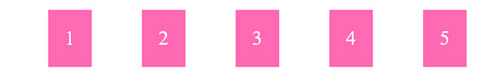
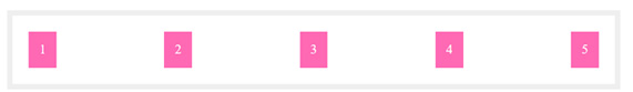
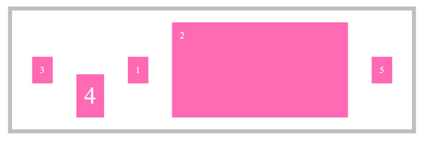
1 Display: flex Property
HTML<div class=”container”> |
CSS.container{ display: flex; } |
Result
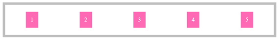
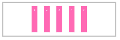
2. Display:flex; Flex Direction-direction:row;
HTML<div class=”container”> |
CSS.container{ display: flex; flex-direction: row;} |
Result
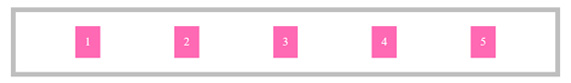
3. Display:flex; flex-direction: row-reverse;
HTML<div class=”container”> |
CSS.container{ display: flex; flex-direction: row-reverse;} |
Result

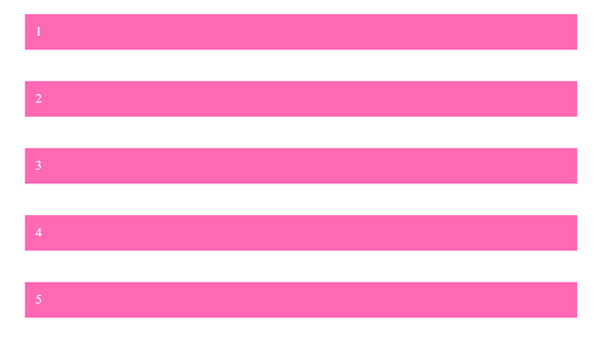
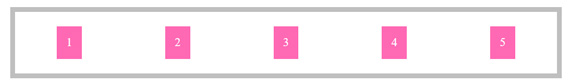
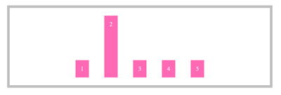
5. Display : flex; flex-direction: column;
HTML<div class=”container”> |
CSS.container{ display: flex; flex-direction: column;} |
Result
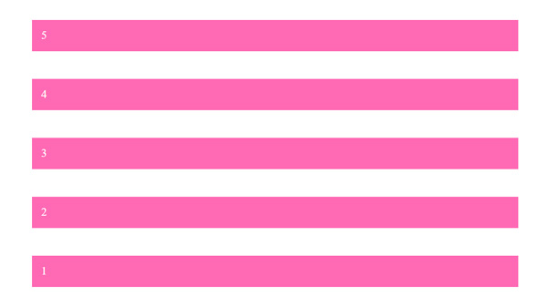
6. Display : flex; flex-direction: column-reverse;
HTML<div class=”container”> |
CSS.container{ display: flex; flex-direction: column-reverse;} |
Result
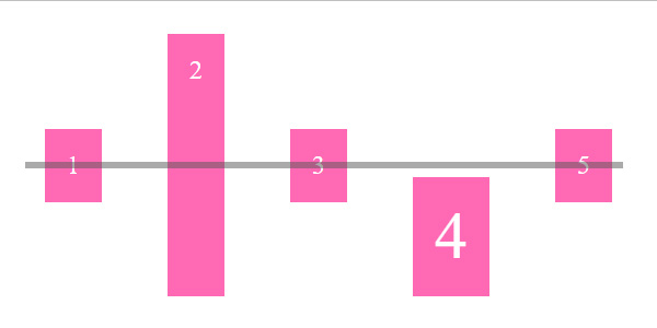
7. Display : flex; flex-direction: row; justify-content: center;
HTML<div class=”container”> |
CSS.container{ display: flex; |
Result

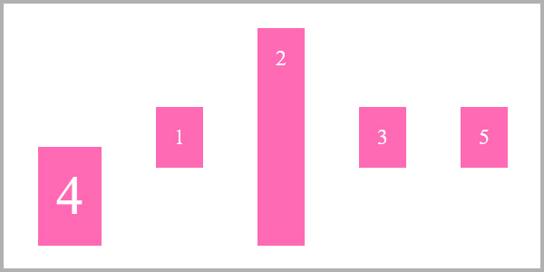
8. Display : flex; flex-direction: row; justify-content: space-between;
HTML<div class=”container”> |
CSS.container{ display: flex; |
Result
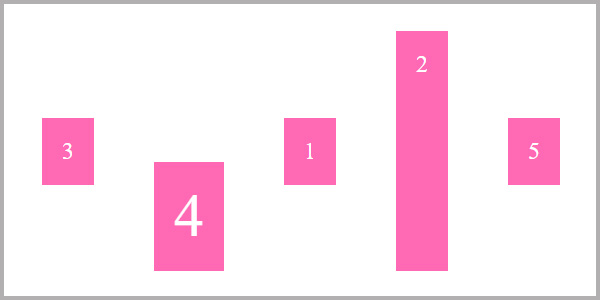
9. Display : flex; flex-direction: row; justify-content: space-around;
HTML<div class=”container”> |
CSS.container{ display: flex; |
Result
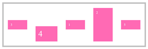
10. Display : flex; flex-direction: row; justify-content: space-evenly;
HTML<div class=”container”> |
CSS.container{ display: flex; |
Result
11. Display : flex; flex-direction: row; justify-content: space-evenly;
HTML<div class=”container”> |
CSS.container{ display: flex; |
Result
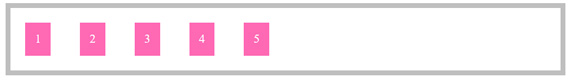
12. Display : flex; flex-direction: row; justify-content: flex-end;
HTML<div class=”container”> |
CSS.container{ display: flex; |
Result
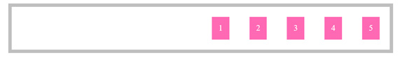
13. Display : flex; flex-direction: row; justify-content: flex-start;
HTML<div class=”container”> |
CSS.container{ display: flex; |
Result
14. Display : flex; flex-direction: row; justify-content: center; align-item: center;
HTML<div class=”container”> |
CSS.container{ display: flex; .i2{ height: 200px;} |
Result
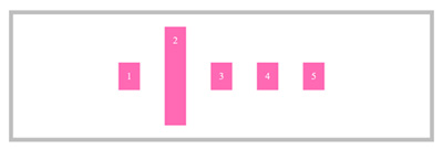
15. Display : flex; flex-direction: row; justify-content: center; align-item: flex-start;
HTML<div class=”container”> |
CSS.container{ display: flex; .i2{ height: 200px;} |
Result
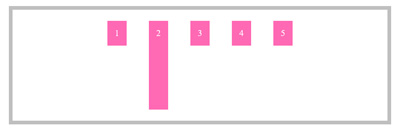
16. Display : flex; flex-direction: row; justify-content: center; align-item: flex-end;
HTML<div class=”container”> |
CSS.container{ display: flex; .i2{ height: 200px;} |
Result
17. Display : flex; flex-direction: row; justify-content: center; align-item: flex-stretch;
HTML<div class=”container”> |
CSS.container{ display: flex; .i2{ height: 200px;} |
Result
18. Display : flex; flex-direction: row; justify-content: center; align-item: baseline;
HTML<div class=”container”> |
CSS.container{ display: flex; .i2{ height: 200px;} .i4{ font-size: 60px !important; } |
Result
Flex Box Items
19. Flex Item – Flex Start
HTML<div class=”container”> |
CSS.container{ display: flex; .i2{ height: 200px;} .i4{ font-size: 60px !important; align-self: flex-start; } |
Result
20. Align Item Flex End
HTML<div class=”container”> |
CSS.container{ display: flex; .i2{ height: 200px;} .i4{ font-size: 60px !important; align-self: flex-end; } |
Output
21. Flex Item Order
HTML<div class=”container”> |
CSS.container{ display: flex; |
Result
22. Other Example of Flex item Order
HTML<div class=”container”> |
CSS.container{ display: flex; .i2{ height: 200px;} .i4{ font-size: 60px !important; align-self: flex-end; order: -1; } .i3{ order: -2; } |
Output
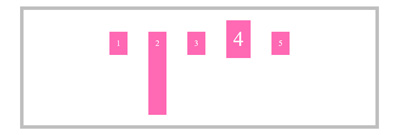
23. Flexbox flex item property flex-grow.
HTML<div class=”container”> |
CSS.item{ flex-grow: 1; } |
Output
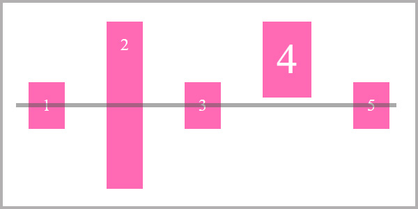
24. Flexbox flex item property flex glow with other element within a div.
HTML<div class=”container”> |
CSS.item{ flex-grow: 1; } .i3{ flex-grow:2} |
Output
24. Flexbox flex item property flex glow with other element within a div.
HTML<div class=”container”> |
CSS.item{ flex-grow: 1; } |